Optimizing Your Shopify Store for Mobile in 2024
In 2024, mobile shopping is more prevalent than ever. Learn how to optimize your Shopify store to capture and engage mobile users effectively.
Understanding the Mobile-First Approach
In the rapidly evolving e-commerce landscape, adopting a mobile-first approach is no longer optional—it's essential. The mobile-first approach prioritizes the mobile user experience, ensuring that your Shopify store is fully optimized for mobile devices before considering desktop versions. This strategy is crucial as more consumers prefer shopping on their smartphones and tablets.
A mobile-first approach involves designing your site for small screens initially and then scaling up for larger screens. This ensures that the mobile version of your site is not just a trimmed-down version of the desktop site but a fully functional, user-friendly experience tailored to mobile users.
Essential Mobile Optimization Techniques
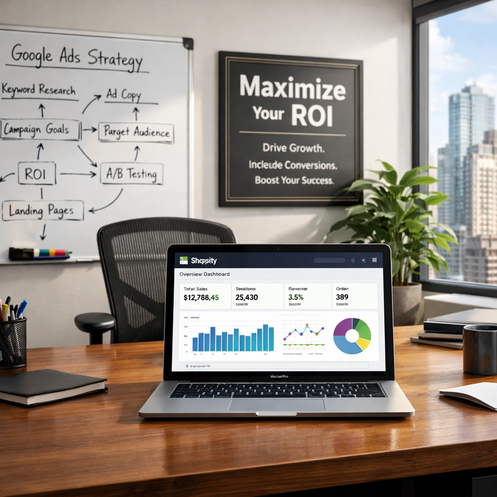
To optimize your Shopify store for mobile users, start by ensuring your website loads quickly. Mobile users expect fast loading times, and delays can lead to higher bounce rates. Use tools like Google's PageSpeed Insights to identify and fix performance issues.
Another key technique is responsive design. Make sure your website layout adapts seamlessly to different screen sizes. This includes optimizing images for mobile devices, using scalable fonts, and ensuring buttons and links are easily tappable.
It's also important to simplify navigation. Mobile users should be able to find what they're looking for with minimal effort. Use clear and concise menus, a powerful search function, and intuitive category structures to enhance the user experience.
Leveraging Shopify's Mobile-Friendly Features
Shopify offers a range of built-in features designed to enhance the mobile shopping experience. For instance, Shopify's mobile themes are designed to be fully responsive, ensuring your store looks great on any device.
Take advantage of Shopify's Accelerated Mobile Pages (AMP) to improve page load times and reduce bounce rates. AMP creates lightweight versions of your web pages, providing a faster and smoother browsing experience for mobile users.
Additionally, Shopify's mobile-friendly checkout process reduces friction and helps increase conversion rates. Features like autofill for address fields and mobile payment options, such as Apple Pay and Google Pay, make it easy for customers to complete their purchases on their smartphones.
Must-Have Apps for Mobile Optimization
Several Shopify apps can further enhance your store's mobile performance. The 'PageSpeed Guru' app helps optimize your site's speed by compressing images, minifying code, and leveraging browser caching.
For better user engagement, consider the 'PushOwl' app, which enables you to send push notifications to mobile users. This can be a powerful tool for driving traffic and increasing sales.
The 'Mobile Converter' app is another must-have, offering features like mobile-friendly pop-ups, sticky add-to-cart buttons, and quick buy options. These tools can significantly improve the mobile shopping experience and boost conversion rates.
Future Trends in Mobile E-Commerce
Looking ahead, several trends are set to shape the future of mobile e-commerce. One major trend is the rise of voice search. As more consumers use voice assistants like Siri and Google Assistant, optimizing your Shopify store for voice search will become increasingly important.
Another trend is the integration of augmented reality (AR) in mobile shopping experiences. AR allows customers to visualize products in their real-world environments, enhancing the shopping experience and reducing return rates.
Lastly, personalization will continue to be a key driver of mobile e-commerce success. Using data to deliver personalized product recommendations, offers, and content can significantly improve customer engagement and loyalty.